An anon on 4chan who works as a statistician studies the US election vote data for signs of fraud:

GATHER ROUND ANONS AND GET READY TO SCREENCAP.
I’m still working on my analysis, but I want to share my initial findings with the rest of you. I think I’m starting to get an idea of where, and how, the fraud is happening, and how we can spot it. Here we go:
So first things first: an incredibly based anon last night was kind enough to write a script to scrape the national ballot counting time series data off of the New York Times website. This is based on their proprietary “Edison” data source which would ordinarily be impossible to access for people outside the press.
The CSV is available here:
http://s000.tinyupload.com/?file_id=14566999163598825215
And the script to generate it is here:
https://pastebin.com/NkYXrJEXI suggest that everyone reading this back up both of these files, because this is an extremely important data source, and we can’t risk anyone taking it down.
At my job, I specialize in time series analysis, and one thing that I have learned is that it’s extremely difficult to create convincing synthetic time series data. By looking at the time series logs of the ballot counting process for the entire country, we can very easily spot fraud.
continued:
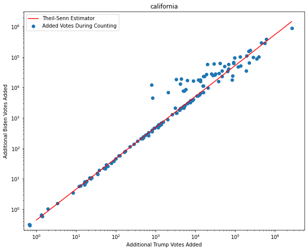
One of the first things that I noticed while exploring dataset is that there seems to be an obvious pattern in the ratio of new Biden ballots to new Trump ballots. As we can see on this log-log plot, for many of the counting progress updates, we see an almost constant ratio of Biden to Trump. It’s such a regular pattern that we can actually fit a linear regression model to it with near-perfect accuracy, barring some outliers.
How could this be possible? Is this a telltale sign of fraud? Surprisingly, as I will show in the next few posts, the answer is no! This is actually expected behavior. Also, we can use this weird pattern in the ballt counting to spot fraud.
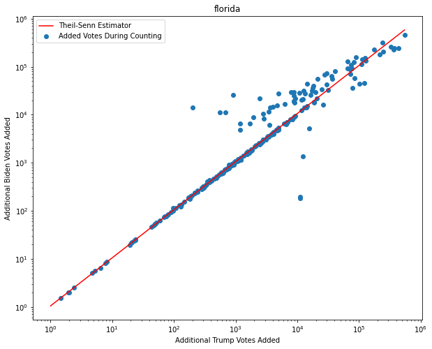
Here is the same pattern for Florida. We see this linear pattern again
and again
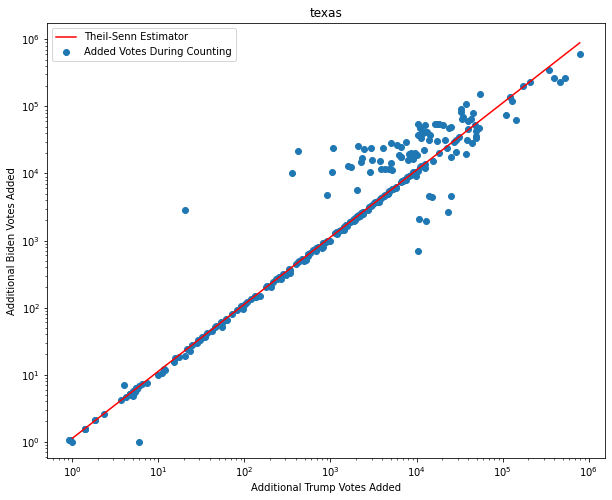
and again
and again all over the country. What appears to be happening is that points on the straight line are actually mail in votes. The reason they’re so homogeneous across with respect to the ratio of Biden vs. Trump votes is that they get randomly shuffled in the mail like a deck of cards. Since the ballots are randomly mixed together during transport, spanning areas occupied by multiple voting demographics, we can expect that the ratio of mail-in Biden ballots to mail-in Trump ballots will remain relatively constant over time and across different reporting updates.
Let’s dig a little deeper into this:
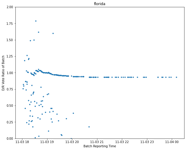
Here is a plot of the same Florida voting data, but this time it’s the ratio of Biden to Trump ballots, versus time. What we see is that the initial ballot reportings are very noisy and “random”.
The initial reporting represents in-person voting. These vote reports have such large variation because in-person voting happens across different geographic areas that have different political alignments. We can see this same pattern of noisy in-person voting, followed by homogeneous mail-in reporting in almost all cases:
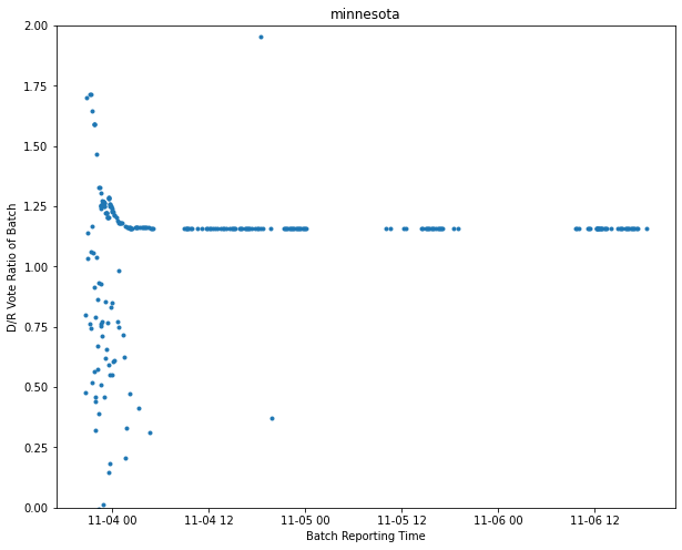
What we see in almost all examples across the country is that the ratio of mail-in Dem to Rep ballots is very consistent across time, but with a notable gradual drift from Dem to slightly more Rep. This slight drift from D to R mail-ins occurs again and again, and is likely due to outlying rural areas having more R votes. These outlying areas take longer to ship their ballots to the polling centers.
Now we’re getting into the really good stuff. When we see mail-in ballot counting where there isn’t relatively stable ratios of D and R ballots that slightly drift R, we have an anomaly. Anomalies themselves are not necessarily fraud, but they can help us spot fraud more easily.
Now let’s look at some anomalies:
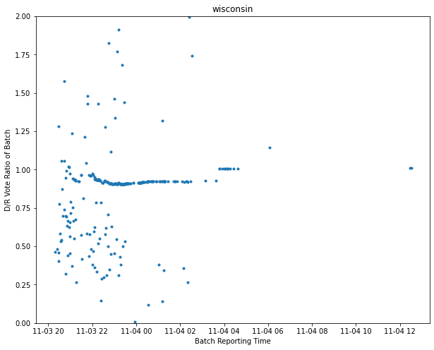
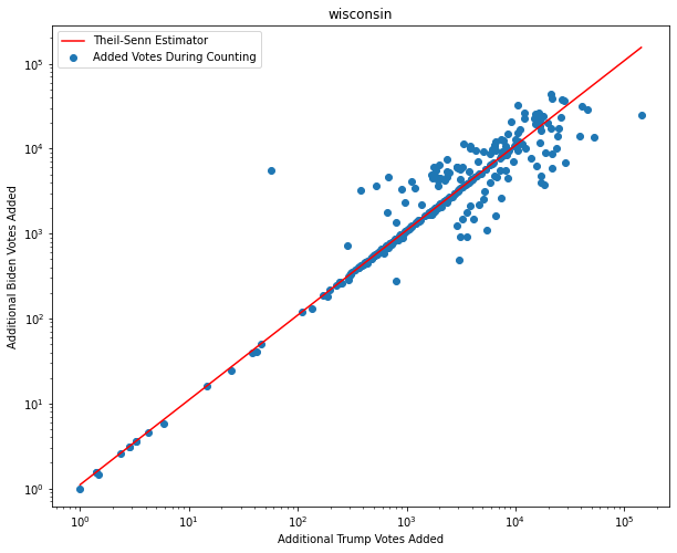
This is the Wisconsin vote counting history log. Again, on the Y axis we have the ratio of D to R ballots in a reporting batch, and on the X axis we have reporting time.
Around 4am there, there is a marked shift in the ratio of D to R mail-in ballots. Based on my other posts in this thread, this should not happen. This is an anomaly, and while anomalies are not always fraud, often they may point to fraud.
So what happened just before 4am CST in Wisconsin? This did!
https://twitter.com/mattsmith_news/status/1323914505638809601Around 3am Wisconsin time, a fresh batch of 169k new absentee ballots arrived. They were supposed to stop accepting new ballots, but eh, whatever I guess.
By 4am the D to R ratio was all thrown out of whack. That is because these ballots were not sampled from the real Wisconsin voter population, and they were not randomized in the mail sorting system with the rest of the other ballots. They inherently have a different D to R signature than the rest of the ballots, quite possibly because additional ballots were added to the batch, either through backdating or ballot manufacturing. Think of this as being kind of analogous to carbon-14 dating, but for ballot batch authenticity.
Let’s look at another anomaly:

Here is Pennsylvania’s vote counting history. For the first part of the vote counting process, we see the same pattern for mail-in ballots that we’ve seen in every other state in the country, which is a relatively stable D to R ratio that gradually drifts R as more ballots come in from rural outlying areas.
But then as counting continues, the D to R ratio in mail-in ballots inexplicably begin increasing. Again, this should not happen, and it is observed almost nowhere else in the country, because all of the ballots are randomly shuffled in the mail system and should be homogeneous during counting. The only exceptions to this are other suspect states that also have anomalies.
Again, this is likely evidence of ballot backdating or manufacturing.
Let’s look at another anomaly:
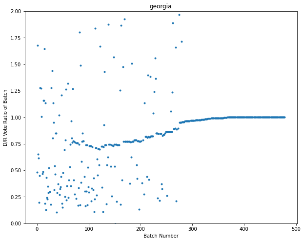
In Georgia we see pretty much the same story as Pennsylvania: increasing fractions of mail-in D ballots over time, even though it defies logic and we see this pattern nowhere else in the country.
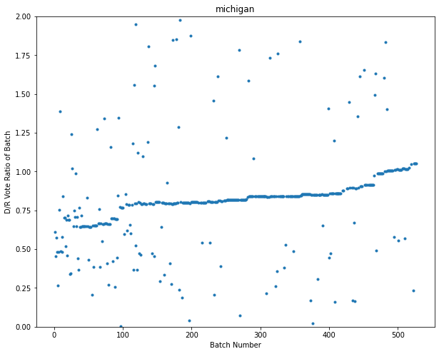
In Michigan, we see a combination of the Wisconsin strangeness, together with the GA/PA weirdness. We see both signs of contaminated ballot dumping, and ballot ratios drifting toward dems when they should not be.
(also 200 posts in the thread, hope you guys are screencapping this so far)
And another anomaly:
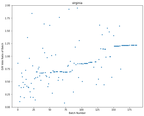
Now in fairness, Virginia is the only state out of the 50 that has anomalies but has not had accusations of voter fraud yet. I think this is the exception that proves the rule. I’m not sure what’s special about Virginia that causes its mail-in-votes to shift D so much over time, but here it is as proof that I’m not hiding anything or being biased.
So let me wrap all of this up:
TL;DR: Dems shot themselves in the foot because making everyone do mail-in ballots actually makes it easier to catch mail-in ballot fraud. Because all of the ballots go through the postal system, they get shuffled like a deck of cards, so we expect reported ballot return to be extremely UNIFORM in terms of dem vs. rep ratio, but to drift slightly towards reps over time because some of those ballots travel farther. We can use this pattern to detect election anomalies.
Please screencap and share. If you think you’re someone important and want to talk to me about these results, email me at sunglasses.engi@gmail.com.
Original screen cap:

